Closing the health gap: Leveraging AI to improve health outcomes and experiences for Black patients in Canada
The Problem:
Black patients in Canada have negative experiences navigating the Canadian health care system due to a shortage of culturally sensitive health care providers which leads to long wait times, delayed or no care, late or misdiagnosis and worse health outcomes.
Solution:
I worked with a cross-functional team to run design sprints over 8 weeks using design thinking principles and methodologies that included empathizing, defining the problem, ideation, prototyping, and testing. After iterating we were able to design a prototype of a web-responsive health chatbot application that utilizes AI to support the personalized and culturally sensitive diagnosis and triaging of Black patients to improve their experience with the Canadian health care system.
My Role:
Myself and another designer conducted user research, data synthesization, wireframing, prototyping and user testing.
Research:
Initially the team hypothesized that Black patients needed tools to support self-advocacy, specifically an application to help them understand medical language so that they could better discuss their symptoms with medical professionals, improving communication and potentially speeding up access to accurate diagnosis and potentially improving health outcomes.
To test our hypothesis, I collaborated with another product designer to develop 16 questions for user interviews to hear the experiences of Black patients navigating the Canadian health care system, in-depth. I also collaborated with the business analysts to develop a 15 question survey so that we could gather qualitative and quantitative data from a wide audience. The business analysts also conducted competitive analysis so that we could surface opportunities for improvement over competitor applications.
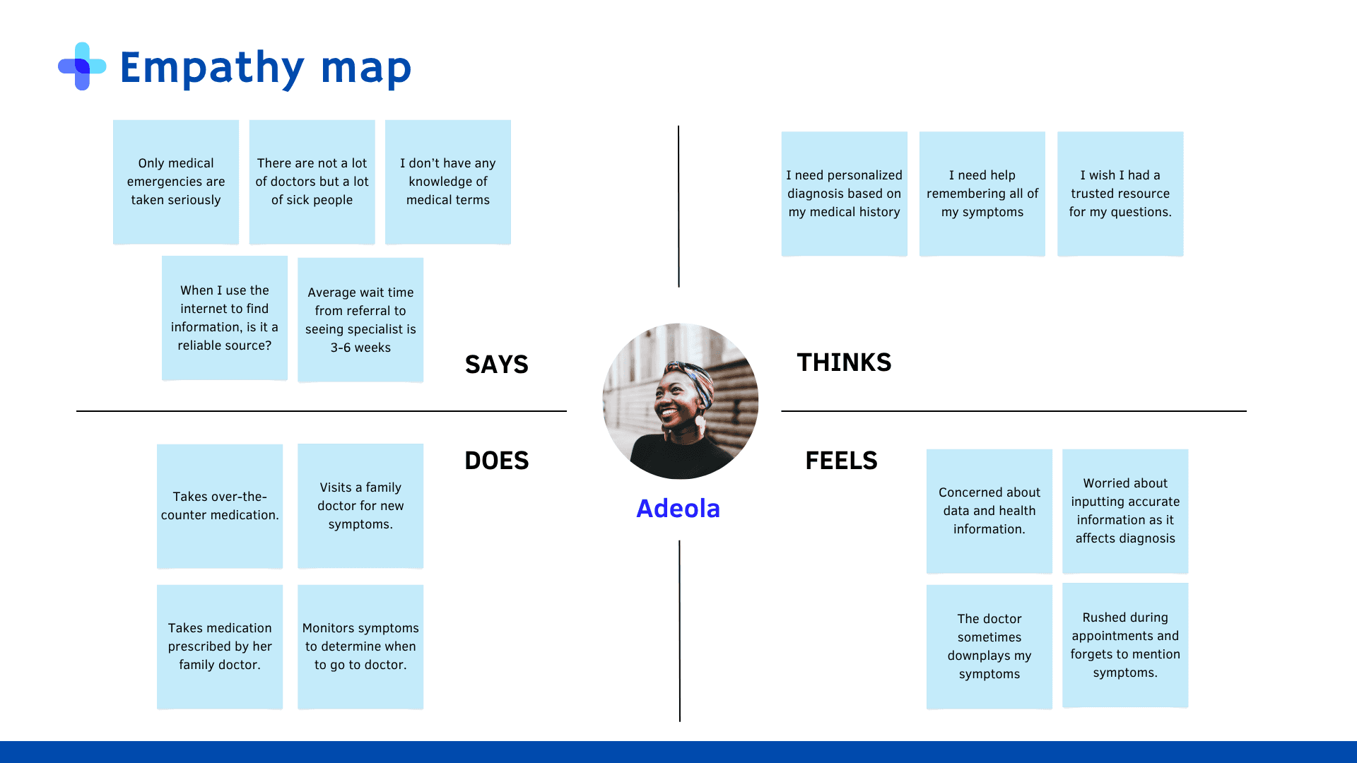
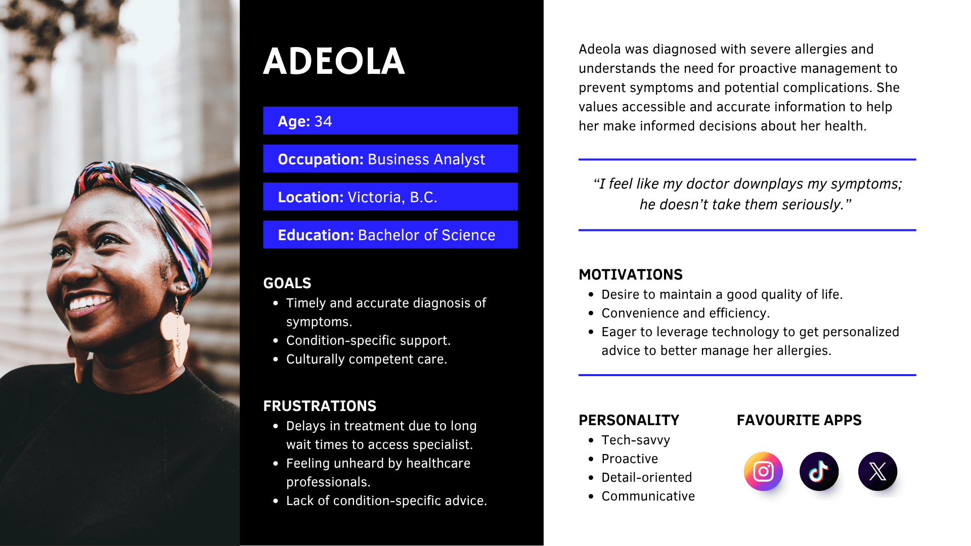
We conducted nine user interviews and received 40 responses to the survey. Myself and another designer synthesized the data using empathy maps to develop a user personas which enabled us to narrow scope on the core features and functionality of the application.
Insights:
The data revealed the following pain points for users:
Delays in access: When Black patients do seek healthcare they experience increasingly long wait times to access a doctor and even longer wait times for accessing specialists for follow-up.
Symptom minimization or dismissal: When Black patients are able to engage with medical professionals they feel the appointments are rushed and that the doctors do not take their symptoms seriously, missing opportunities for referrals or accurate diagnosis.
Lack of personalization: When Black patients attempt to resolve healthcare matters on their own via seeking answers online, the results often lack consideration for their personal medical history and additional factors such as race or culture.
These insights shifted our focus from supporting patients with self-advocacy to supporting medical professionals and patients with triage and diagnosis. In our design concept, users would need a way to input their medical and demographic information for personalization. Users would also need a way to input their symptoms and receive potential diagnosis from a database with reliable and trustworthy information to reduce symptom minimization or dismissal. Based on the symptoms they input, they would also need advice on whether or not to access medical care, reducing delays in access by sifting out patients who seek medical care unnecessarily.
Prototyping:
While my fellow designer and I collaborated throughout the entire design process, we delegated user flows to increase productivity and efficiency. I was responsible for the profile creation (which includes medical history input and demographics input), and symptom analysis user flows.
Profile creation, medical history and demographic information
Ideally, our team would partner with medical institutions and agencies to auto populate patient history and information. However, in the case where a patient cannot access the healthcare system, they should have the option to enter or update their information manually. Initially I designed and organized the medical history frames to be similar to a patient intake form as this would be familiar to most users who have engaged with the healthcare system. However, this approach would have made the process too long and laborious for users, especially if they are using the app on smaller devices like their phones. To address these challenges, I iterated on the design to reduce the number of screens required and reduced the amount of effort required to input information.
Wireframe

Mockup

Symptom Analysis
The core feature of the application is to provide users with a way to discuss their symptoms with a chatbot who can process their inputs and make recommendations about their potential diagnoses and treatment options by referencing medical databases. Originally, I prioritized users having the ability to express themselves in detail regarding their symptoms and viewing the detailed description of one diagnosis/treatment suggestion prior to seeing the rest. However, I received feedback from the developers that users may not input the correct prompts required to get the most accurate and usable responses from the chatbot. To address this feedback, I researched to learn more about how prompt engineering works and changed the design to include a list of prompts from which users could select to respond to the chatbot. The change had an added benefit of reducing the amount of mental load required of the potentially ill user to answer the questions of the chatbot. Additionally, a user needing to tap through a carousel to see the diagnosis/treatment suggestions increases their mental load as they either have to memorize the suggestions or tap through to review the suggestions again. To correct this, I changed the UI so that all options would be presented at once, if users want to read the detailed descriptions of each diagnosis/treatment suggestion they can select the "read more" link which redirects them to a page with a longer description.
Wireframe

Mockup

Testing
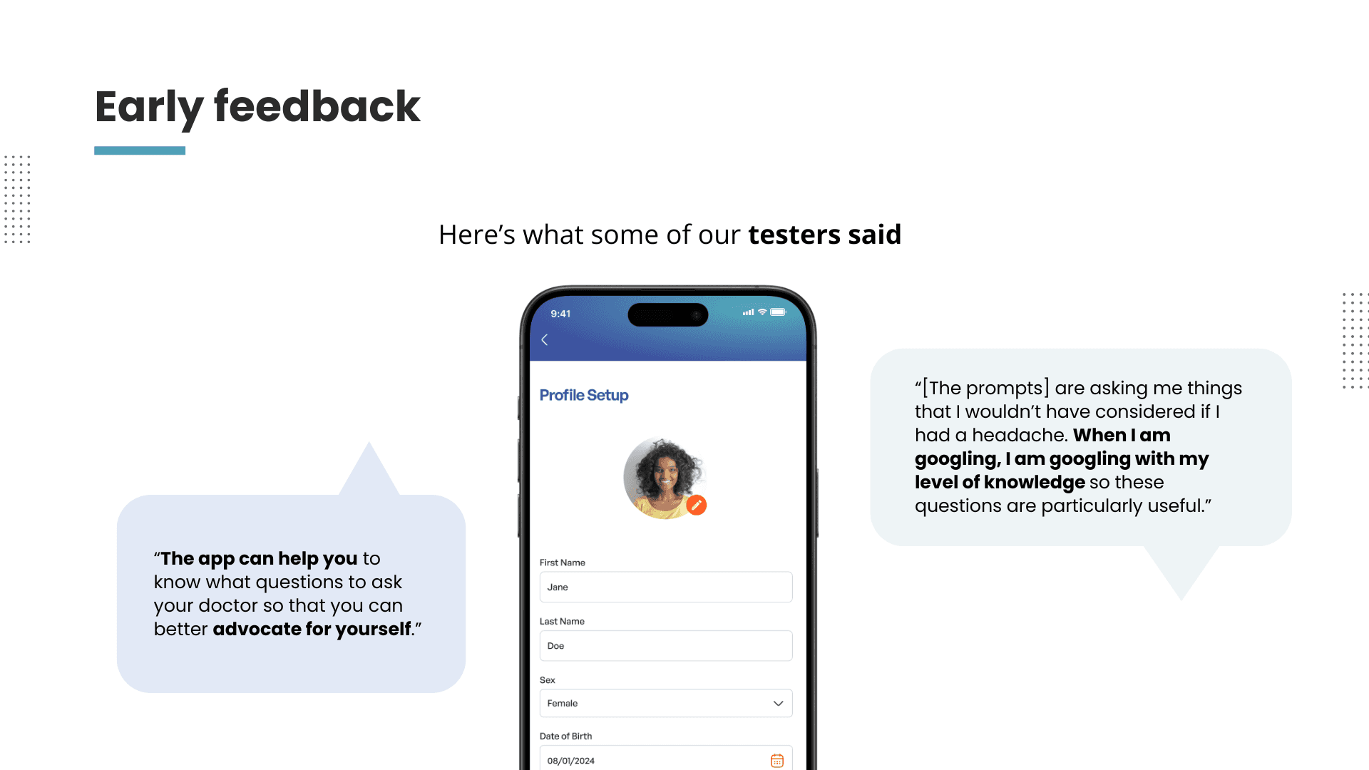
We received very positive feedback from the usability tests we conducted on our finalized prototype. Users appreciated the way the medical history and demographic input pages were organized as they felt that there was a lot of thought put into how and why the information was being collected. They also appreciated the way that the chatbot asked questions that they would not have considered on their own when attempting self-diagnosis. In terms of improvement, we received feedback that the amount of information we provided in both the diagnosis and treatment suggestions were overwhelming, so we shortened them in the final prototype.
What I learned:
Designing for AI requires understanding how both humans and AI generators “think” in order to best get the results that users want.
Users are still looking for human-like experiences even when they are interacting with AI. This is especially the case with Black patients navigating the health care system where they already feel dehumanized at times.